Monday 30 June 2008

Taormina - work in progress

It's been a criminally long time since I managed to get an episode of Taormina posted...
So, just so the three of you out there who're following her adventures don't think I've let her fall by the wayside. I thought I'd post a bit of work in progress.


This is the first panel, without line-work for now. There are some details to tighten up but the main thing I'm not happy with is the arm holding the log. Her whole pose is supposed to be a bit Boudicca. She is not worried about the haima-vulture and I want to maintain that confidence in her. Perhaps I can just lose the log from the last episode, not worry about that level of continuity and just have her hold on with both hands?

Anyway, this is just a taster and I hope to get the episode finished and posted this week.

Both the creatures in this are fierce too!

Friday 27 June 2008

Illustration Friday - "Fierce"


This was another of those PODZ creatures... This one was part crocodile but mainly kangaroo. Stupid really. I always thought this one was quite fierce though, so there's my link to Illustration friday's topic this week.

Self Portrait


This is a quick digital self portrait done in photoshop... I used the in-built camera in my mac to take the reference shot then sketched this out... start to finish was about 1hr 20mins.
There's some stuff wrong with it but in the time frame it's an ok likeness I think. If the hair looks a bit weird to you, I've got that bit right, I really do have Reed Richard's hair but I'm not quite as flexible as Mr. Fantastic!

Wednesday 25 June 2008

"I'll never join you!"


"But I was going into Toshi Station to pick up some power converters!"

There's huge differences in Mark Hamill's face between episodes IV and V that's makes it tough to do a good early Luke. A car accident I think was the cause of the change, I've tried to get a bit of the earlier luke in with his more familiar physiognomy.

This is a quick digital again, but I think this one is less successful than my previous Star Wars caricatures, not sure who I'll pick next...

Tuesday 24 June 2008

"Help me Obi-Wan Kenobi!"


She had some of the best lines and the weirdest hairdos... I'm not mentioning the outfits, especially the slave girl outfit, not mentioning that at all but I know all you other boys are thinking about it again.

Not sure how successful this is, take away the danish pastries and I'm not sure you'd know it's her...

Monday 23 June 2008

Big Beautiful Wonder Woman

At the end of last week I discovered a great blog called The Big Beautiful Wonder Woman Blog. The project is run by Jamar Nicholas who says of the blog: "I admire and enjoy the female form in all its sizes, especially ladies with some meat on them. Thus, my idea for collecting art of a bigger-sized Wonder Woman happened..."

He encourages submissions by other artists, and after the Superman redesign I was itching to draw another superhero.


This little project fit the bill perfectly. I wanted to show a big buxom, sexy, wonder woman who was definitely in the larger sizes, it seemed a natural progression to make this into a spoof cover of all those waif-encouraging magazines.

I really enjoyed this, I hope you will too.

•••EDIT•••
Jamar has posted my entry up on the BBWWB along with some truly humbling comments, thanks man!

Sunday 22 June 2008

Friday 20 June 2008

Freeing My Bonds

A hoard of Bonds?


James Brawn

Double O Saving

Doublet Status

Eye Spy

Bond of Marriage

Bawned, Jaymsh Bawned
the original and still the best!


My Puns aren't great, but some of the others I had were worse - Double O Suaving, Oh, Oh Heaven and Sleak Rat Agent for example were awful. Have a go at coming up with witty alternatives for 007's names, it's not as easy as you think.

I'm really happy with Sean, Daniel and Pierce. These are all quick Photoshop efforts, I did colour for Sean and Daniel as they are the book ends for the character and I'm just playing at the moment, trying to gauge how successful/commercial these things might be.

Thursday 19 June 2008

QI Gang - Delicate Distortions


Alan Davies, probably best known as Jonathan Creek... I've heard that there's a new TV special coming later in the year, that could be worth a watch.


Phil Jupitus, another regular on QI and also the other team leader on Nevermind the Buzzcocks with Bill Bailey.


Jimmy Carr, is everywhere, perhaps he's omnipresent, 8 out of 10 cats, Quiz of the year (success down to Noel Fielding and Russell Brand I think there) and is also a regular on QI.

All of these guys also have great stand-up careers, a common feature of stand-up of course is that all important punchline!

Bit of a theme here with these caricatures, I'm not sure about the Alan Davies, but I like the Jimmy Carr... They're pretty quick to do in Photoshop to this sort of standard, but should I pursue this direction any further? With no work coming in, things are pretty concerning.

I think my caricatures aren't that extreme, more sort of delicate distortions but not portraits.

QI Gang sounds like the name of a Jedi to me...

Wednesday 18 June 2008

Stephen Fry

A much loved English treasure, one of the smartest blokes around, host of the brilliant quizshow QI...


He's a real renaissance man, our Stephen Fry... Comedy series credits too long to mention, best selling books, films, serious documentaries and quizmaster. He's got a great website too.

He reads the Harry Potter Audiobooks - but he'd have been perfect for Dumbledore in the films!

This is the second of my caricatures done roughly in photoshop, just trying it out really... watch out for Alan Davies, Phil Jupitus and possibly Jimmy Carr coming soon! All of them deliver punchlines! Also, see Bill Bailey from earlier this week!

Tuesday 17 June 2008

Superman : Man of Style!

I found a great website called Project Rooftop via drawingboard that holds regular redesign contests. This month sees Superman's 70th birthday! He doesn't look bad for an old fella, does he? Anyway, the brief was to re-design his outfit...

01 02
03 04


I wanted to streamline the suit, get rid of the cape which I always felt would bunch-up and give Clark a hunchback when he wore his civilian clothes. Once I had done that there was the issue of colour, I wanted to see the traditional colours (01) in order to judge my other treatments against it. Firstly I went all X-men and Batman black and rubbery (02), then I tried hinting at the old Kryptonite (03) but in the end I liked the cooler, de-saturated feel (04).

I also redesigned the logo, well in marketing terms I think they call this a refresh!


For a comparison to the traditional Super-suit please take another look at my other Superman illustration: Superman's Dilemma

I had a great time doing this but in the end, Superman is just fine as he is, roll on another 70 years!

Monday 16 June 2008

Bill Bailey

One of the funniest blokes around... and he was the guest on Desert Island Discs on Radio4 last week.


If you're not familiar with Bill, Black Books, Spaced, QI and Nevermind the Buzzcocks will help you out of your dark days!

Check out Bill's website too. The faster html site is good and the flash-rich site is supremely silly - the choice is yours!

Bill doesn't really rely on the old punchline too much and I suppose that is a pretty thin link for the Illustration Friday topic this week.

This is a quick digital caricature done in photoshop - I'm not sure whether it's worth finishing or not.

Another Environment

I did this after being sent a 'homework' assignment from a games company. They wanted to see buildings that sat comfortably in their environment and places for characters to hide/explore...


Alleyways, a pub and an all-night fuel station... at the end of the street I imagine there are playing fields behind wrought iron railings and beyond that, who knows what horrors!

Again, this is rough concept type stuff.

Thursday 12 June 2008

Illustration Friday - "Forgotten"


This week, it seems, that I have forgotten how to draw.

I was going to spout some old cobblers about getting back to a more primitive kind of art, really feeling my roots and trying to express the inner child still within me... but nah, I've just been drawing like a drunken monkey this week, my ideas haven't been much better either.

Saturday 7 June 2008

Just One More Book Logo


My good pal Matt gave me the link to a website that reviews kids' books, they are looking to redesign their website and have put out a call for concepts - for more information please visit the just one more book website.

I wanted my approach to hint at the magic of a book that you grow to love... I've always loved secondhand bookshops, digging around to find those lovely musty old books, first editions and rare misprints or simply fantastic bargains.

There is a particular smell that old books seem to have when in quantity and something peaceful about those old shops too. I feel increasingly sad that most of them will soon close and trade online... end of an age really.

Tuesday 3 June 2008

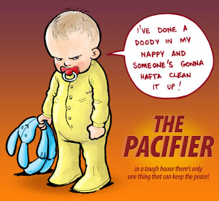
Illustration Friday - "Baby"


You'd better pray that this baby never comes to visit you...

Seemed like a brilliant movie title until I looked up on IMDb, there was a movie called the PACIFIER and it starred Vin Diesel, I think I'd rather see a film with this baby in it!

Concept Design

I've been trying to get some work with video games developers...

To that end I've produced a few relatively quick concept pieces. Firstly, environment concept paintings, these are really quick 150dpi photoshop paintings...

The Haunted Graveyard

Colonel Gerald's Sitting Room

The Mountain Pass

The Snowy Wood (you may have seen this one before)

Secondly I've done some Pirate designs, I decided to pick Captains and Cooks as being particularly archetypal in a Treasure Island kind of way...

Sketched thumbnails to show a variety of my concepts:

Presentation of my favoured approaches with alternative colour schemes.

I tried not to get too tied up with being perfect, these are, after all, only supposed to be concepts...