Showing posts with label Sci-Fi. Show all posts

Wednesday, 20 July 2011

Scotch Corner is Two

Well, last month I was delighted to be invited to contribute once again to Scotch Corner, the Caledonian Comic Artists Collective who're celebrating their blogging birthday this month with a series of guest slots. I'm am amongst some seriously talented folk contributing, too many cool people to name have already contributed - and there's more to come!

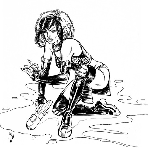
Previously, I've submitted Bat-world pieces to their guest slot: a Harley Quinn, a Joker, and a Catwoman, but no surprises, it is 2000ad that I have turned to on this special occasion. Specifically the world of Strontium Dog, and as is usual for me, I gravitated to the girl in the gang - Durham Red.


You can see the full coloured version of that over on Scotch Corner. Also note the edited hand... after I'd inked it, and saught the advice of trusted indivduals, I felt this version was too claw like.

If you like this, then please come back tomorrow as I'll be posting up a piece that celebrates the return of Johnny Alpha, in fact, the resurrection of Johnny Alpha and his imminent return to the prog - as trailered in prog 1742, see the prog or ECBT2000ad for the details!

Saturday, 27 November 2010

The Interview


You may remember I recently plugged John Freeman's book Sci-Fi Art Now.

As part of the promotion for the book he's been interviewing all the contributors... mine is now up on the Sci-Fi Art Now blog.

I hope it's of interest, and not pretentious... I am excited all the same to have been interviewed about my work!

Tuesday, 9 November 2010

Very Complimentary

Well, I've just received a couple of comp copies of two publications I've got work in...


As previously blogged, I've got 'The Squadron' in Sci-Fi Art Now, a thumping good coffee table style book crammed with fantastic pieces of art from some seriously impressive names. You can also read about my process for that piece here from earlier in the year.
Sci-Fi Art Now is available from all good bookshops and on amazon still for the bargain price of £13.99

The other illustration is for a story called 'Stone' by Neil Beynon in the British Fantasy Award winning anthology title Murky Depths.


Please order your copy of Murky Depths #14 here.

Monday, 18 October 2010

BICS 2010

This year, I was pretty unprepared and not that confident about my portfolio, perverse then, that I was the most relaxed I have been at any of the three BICS I have attended.

It was really good to see old friends and make new ones, so, thanks to everyone for a great weekend!


The highlights for me, amongst many fabulous chats with too many cool people to mention here (for fear of missing anyone out) were:

1. I got to see a copy of Sci-Fi Art Now which I have the above illustration featured in, alongside some heavyweights of the genre. John Freeman has put together a cracking coffee table book, the kind I would have poured over as a child. The book is currently only £13.99 so please go buy a copy!

2. The slightly awe inspiring incident when I decided to ask Dave Gibbons whether he'd mind looking at my portfolio.
He really liked my work and felt that on the whole it was nice stuff particularly facial expressions, it was just there were a few small things letting me down, one of which I had done repeatedly.
Tangents.

So, what is a tangent with respect to comic art and why is this bad?

It's a situation where a line in your panel creates a tangent to the border or another feature or line in your panel as with this example here.

The problem is that it can flatten a panel because you lose depth when a line runs into another that should look like it is in another plane of the image.

Forget for a moment that the arm is a little anatomically dodgy, the major factor spoiling the composition of the panel is at the shoulder where the inked line meets the border.

The slightly frustrating thing is, they are pretty easy to avoid in this instance by simply having the panel border crop the figure or alternatively allow enough space away from the panel edge.

It's pretty clear to see the massive improvement not only in how the eye is not drawn to the panel border, but in the composition also.

Honestly, it's just a little careless. It was discussed elsewhere but is relevant here, as an artist, you instinctively know when something is wrong, you can see it even if you don't quite know what it is.

More often than not, it takes someone else to point it out, in my case Dave Gibbons pointed it out repeatedly within my portfolio, much to my embarrassment, but as he wisely said, "You'll never do it again, will you?" and I certainly hope not to.


Tangents can occur within the panel too, and it's a little tricky to describe in words, hopefully the quick sketches that Dave did for me to illustrate the concept will help any interested party to understand the potential pitfall.

There are a long and tough set of concepts that need to be bore in mind when laying out a page of sequential art, and it is easy to forget something you know, or should be proficient at.

Something as simple as the breaking down a panel into three planes.

My panel here is suffering from more than that but the fix is simple if we look at the quick sketch Dave did to remind me how I could have avoided most of the problems.

Black placement and line weight become much easier to decide upon when the panel is broken down in this way.

It's simple, logical and creates greater depth within the panel. Irritatingly it's something I've fallen foul of before, again, I hope to never make the same mistake again.

Finally Dave gave me a tip on how to hold my brush, there's no need for puerile or childish jokes, this is a serious matter and will give you greater control over your line for fine detail. very simply put, hold your brush upright.

It's a Chinese technique and the name Dave told me for it escapes me for the moment, as does the name of a classic EC cartoonist my work reminded Dave of.

Encouraged that Dave Gibbons, that's Dave Gibbons folks, liked my work I approached another couple of editors on the Sunday, one of whom told me that my portfolio was the best he'd seen all weekend. Humbled, chuffed etc. I left Birmingham far more confident, happy and inspired than when I arrived.

Wednesday, 22 September 2010

Mega, Mega City One

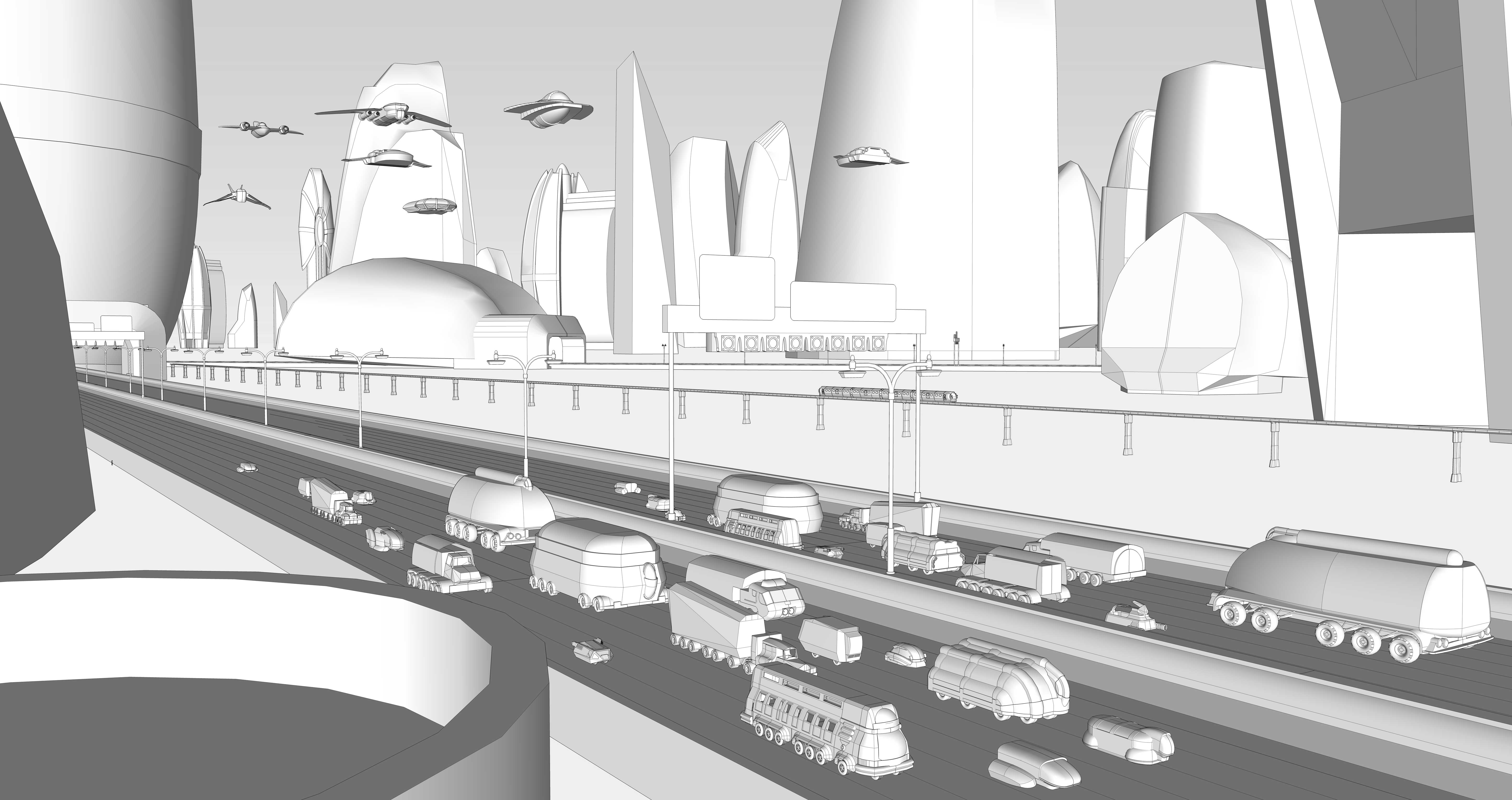
To go along with the Lawmaster I made a while ago in Google Sketch-Up, I've built a section of Mega-City One. I've invested some time making vehicles and zooms and bits and pieces to help me frame my panels for a Judge Dredd strip by Lee Robson that I've blogged a little about before.

Click image for a huge, zoom-able version

This is still a work in progress and I'll probably use different views than the one shown here, but that's the beauty of a simple 3D package, I make this once, then I can move things around for the best framing of each panel without having to reconstruct, redraw and redo all those little details again and again. Admittedly, I will to some extent, because I will only be using the exported images as under-lays for each of the panels.

Other resolutions:
700 x 370
1600 x 846

Thursday, 5 August 2010

Judge Dredd Movie Poster

A long time between posts... and I really can't remember what has kept me away so long! This post is my 300th, by the way!


This month's art competition on the 2000ad forum is to design a poster for the upcoming Dredd movie. I'm supposed to be working on a multitude of other things, and so this concept that I had been noodling with probably won't get finished more than this.

Monday, 1 February 2010

Sci-Fi Art Now

Late last year I produced a piece for John Freeman's Sci-Fi Art Now book, the final version of that is still under raps for now.
Well, over the last week, I have been working on another piece for the book. Originally intended as a Steampunk Warfare piece. I played around with an aerial 'dogfight' from WWII as a start point. Spitfires take on a Heinkel He111 bomber with a sort of Art Nouveau influence added to their styling. "THAT'S NOT STEAMPUNK!" I hear you cry, and you're right, it ain't and that was the problem... also that the Spitfires, even with Davinci style wings just asserted their character too heavily.


In my efforts to "Steampunk" this, I found a sort of definition of what it is... "The path not travelled." How would a future or a modern day look if something that had fallen by the wayside in our own world had become a dominant influence/force? It still wasn't really inspiring me, it has to be said...
I thought the problem was that I was lacking any human content, so I tried to add the perspective of one of the Spitfire pilots, albeit skewed with a weird hat design. This naturally led to an inset panel, which in turn led to me developing a whole 'comic strip' treatment for it. One that was based in part upon Roy Lichtenstein's 1963 piece: 'WHAAM!" its self inspired by a DC comic from 1962.


It's just not a single illustration for an art book though, is it? and also there's still that problem with the Spitfire hanging around... I was pretty happy with the Heinkel redesign but still felt the piece lacked something. If the main panel was to succeed, I'd need to feature some kind of narrative. I decided in the end to focus on the 'Future War' aspect of the submission. I thought about a War of the Worlds style flying tripod maybe mixed with a Matrix Sentinel thing... I designed straight out alien ships too, but it was still failing to give me a backstory in my head that I cared about. An unrelated factoid drifted into my brain regarding swarms of small creatures attacking large animals...


Making the seemingly more vulnerable side the winning one was much more interesting to me, almost instantly, in my head, I saw a bonkers looking soldier with rocket boots... air borne infantry! I doubt it is an original idea, but it was that concept that made it work for me. Suddenly, it all seemed to work, in my mind I had a backstory that interested me, there was human content in the illustration and I realised that the ship was vaguely Flash Gordon in influence too!

I'm happy with this and my other submission. I hope that both of them will feature in the book, but there are only 200 spaces and with submissions from some pretty big names in Sci-Fi illustration and comics already in, I'll count myself lucky if I'm included at all!

Friday, 22 January 2010

Evil Genius

The new DrawerGeeks topic is 'Evil Genius'. This was loads and loads of fun with stacks of possibilities. I thought about the classic Donald Pleasance Bond villian and Mike Myers' Dr.Evil that was spawned by him. I thought about Ming the merciless and other such Sci-Fi villains... I thought about Dick Dastardly, The Hooded Claw, Baron Greenback and Dr. Frankenstein... I was tempted to revisit some old ground too.


What have I come up with then? Only a rough sketch, but one that I'm pleased seems to capture the essence of a lot of those characters mentioned above, but it also owes something to Braniac from Superman and Dr. Emit Brown from Back to the Future for the hat thing.

I'd have loved to have a bit more time to work this up, design a proper lair and possibly a henchman or two in the background too, alas time she was a cruel mistress and for now this is where I must leave it.

Oh, and one last thing:
Mwhah-ha-ha-ha-ha-haaaaaaa!

Wednesday, 6 January 2010

Sexy Sci-Fi Siren

A quick sketch for today.


***EDIT*** It would appear that I owe some sort of credit to Dylan Teague here. I think I must have been indirectly or subconsciously influenced by a piece of his work... which can be seen here, and damn fine it is too.