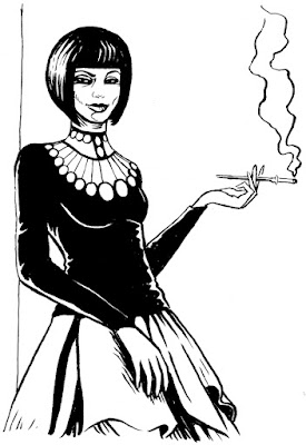
The art swap continues, this one is simply a WWII inspired 'something'. I realise now that Bullseye Bombshell would have been a better name - oh well!
Done for Matt Soffe in return for this deliciously vampish Lulu Romanov. Lulu is the sister of the roguish Nikolai Dante, swashbuckling hero of the 2000ad epic tale of the same name.
Sunday, 27 June 2010
Wednesday, 23 June 2010
Art Swap: The Spider
My Fractal Friction chums are doing an Art Swap, simply put, each has asked the others for a sketch and in return, you guessed it, they get a sketch... see? Art Swap, simple innit?
First up for me is James Corcoran who asked for The Spider... I'll be honest, I only vaguely knew this character existed and so, I'm not 100% sure I've done him justice.
To me this looks like the Count from Sesame Street and there are a couple of obvious things wrong with it as well, but I set myself the task of doing each sketch within a quarter of an hour, I've done them all now and none took more than about 30-40 minutes. I'm pretty happy with them as sketches and I'll post them up as I receive each of my requests.
In return for The Spider, James has already done me this lovely rendition of Jenny Simmons from Caballistics, Inc. Caballistics, Inc. is a 2000ad strip, a fabulously dark paranormal and supernatural story written by Gordon Rennie and drawn by Dom Reardon... if you haven't read it, I can thoroughly recommend it as a sort of UK version of the Hellboy spin-off BPRD.
Friday, 18 June 2010
Fractal Friction Page 26
It was my turn again on Fractal Friction this week. I actually finished the inks for this last thursday and colours on friday, but for obvious reasons couldn't share it until now... well, I sneaked that one edited panel out.
I knew this page was taking place in another dimension, so I thought I'd try a slightly different inking style... and as we were awakening the once and future King, I thought it needed some serious magic mood too. It was a bit of an experiment in using more black areas as well.
The colour palette I chose, again, was supposed to be a bit moody and magical, I was also trying to get a bit of a hint of the colour palette that John Higgins and Sally Hurst have been using in 2000ad... you can judge whether I achieved that here.
It was a really cool page to be doing, the major problem was getting Arthur to look regal and identifiable - 'cos I knew he would be nekkid, and without his crown. The concept for this page was also a real collabrative effort and took place across the e-mail with all of my Fractal Friction cohorts chipping in ideas for how we could 'grow' our new King Arthur!
Thursday, 17 June 2010
Comic Sans: a Rebuke.
My fabulous, multi-talented friend and lettering guru Jim Campbell posted a link on the 2000ad forum to an imagined monologue by the font Comic Sans... A fun piece of creative writing, in defense of the much criticised font. It struck a chord with me though and so I found myself constructing a rebuke on behalf of Dom Casual...
So, In answer to the imagined monologue of Comic Sans by Mike Lacher via Timothy McSweeney's website.
YEAH, YOU'RE COMIC SANS, WELL, I'M DOM CASUAL AND I'M NOT HAPPY.
Guess what, Comic Sans, turns out you are as stupid as you look. You can't compare your self to the likes of Univers... if I was a screwdriver, I wouldn't compare myself to a chisel would I? You need to frame your argument in context. You are at best merely an informal font.
You are not the straight talking man on the street of the font world. You are not a superhero rock star fighting the good fight for fun typography either.
But you're damn right, I don't like seeing you everywhere. You think everyone likes you but you're wrong. They're just using you because you're easy, available and free and that's rarely a good set of characteristics. It's not some elitist pretentious thing either, you're just ugly and not in an interesting way.
You say you're fun, with your multi-purpose uses, you're so wrong, back to my tool analogy - I wouldn't use a spanner to knock in a nail.
The thing is, there are a lot of other fonts out there that are just as much fun as you, myself included. Most of them, more qualified for the job and lets face it, a lot better looking too.
It's these other fonts you're putting out of work, not Helvetica or Futura who can hold their own. It's Challenge, Frankfurter, Hand Drawn and all the other quirky, informal fonts that just do a better job than you ever could. They're not getting the usage they deserve because of you. It's not the c**k-hat typographers you need to worry about you s**t-stick, it's us, the other fonts you think you're mightier than.
So Guess what? Yeah, that's right we've got a posse together, Balloon and Cooper are going to hold you down and then Flash and his brother Flash light are going to work you over a bit. When they're finished, we're just going to leave you alone with One Stroke Script, you've muscled in on his turf once too often.
Just because you're famous doesn't make you good, there is a fast food restaurant in every town, this is not a good thing either. Over saturation can breed contempt and that's the kindest thing I can say about you. Just because the general computer owning population can't see what's wrong with you and just because you're on every computer made since 1994 does not justify your over-use.
So f**k you Comic Sans, you're the fast food of fonts, no substance, no style and of absolutely no beneficial value.
I hope you die alone and penniless in a bin you arrogant, self important jerk.
And if you think of any comebacks, don't bother, I know a whole lot of real comic-book fonts that would just love to know where you live.
Right, I've got a date with Korinna and she comes in extra bold and multilingual, if you know what I mean.
Friday, 11 June 2010
Alas, Poor Yorick!
Here's a panel from something I've been working on... I've edited it (a bit) so as not to give the game away too much (I hope).
I've tried to use black more on this... I was just experimenting really, but moody was the order of the day so, I wanted to at least have some hatching and areas of 'spotted' blacks.
Thursday, 10 June 2010
Wednesday, 9 June 2010
My Grimm Brother
One of my cohorts on Fractal Friction, (the not so grimm) Matte Soffe has done me the honour of inking up some of my recent sketches, please read his full blog posting here.
One of the pieces was my recent Dredd sketch, which he also did some beautiful colouring on... and as if that weren't enough he's been universally lovely about promoting it all over the web too... Thanks Matt, you're a gent, a talented one too.
Labels:
2000AD,
Collaboration,
Colouring,
Inks,
Judge Dredd,
Sketch
Friday, 4 June 2010
More of Dredd's Head
I dunno if I've mentioned it, but I'm going to be doing a Judge Dredd strip for a future issue of Zarjaz, and very excited I am too!
It's a great little story involving Mopads, the mobile homes of the future... written by Lee Robson, it's got old school style and as a warm up I've just done this quick Dredd head.
I've still not settled on a look that I'm happy with, but this has that gritty brooding quality I've been after for a while, if not exactly the style of previous attempts.
Subscribe to:
Posts (Atom)