Monday, 14 October 2013

Disconnected Press Volume 3.

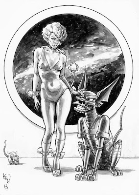
My good friends at Disconnected Press asked me whether I'd be up for providing a cover for their third volume.

My answer was always going to be an emphatic yes (knowing those lovely people as I do) and above is a sneaky, hi-res crop from the very same!

This is a raw scan of my final 'inks', un-fiddled with and simply presented here to show my newer approach using watercolour, I think this method is helping to lift my inked line art and give it a bit more life!

Here also is the very, very rough concept art I sent Liz and Conor. I was surprised that they were happy enough to trust me to finish the cover art from this alone! If you'd like to see the final art to volume three, simply follow this: link!

The final art has been finished in photoshop, tinkering with the heart and adding colour to the figures.

All in all, I'm very pleased with this piece of work - and the stakes were high as the strip that it references has art by the incredibly talented Verity Glass. Who you should definitely check out.

Saturday, 28 September 2013

Hot Dog

Finished a 'sketched' commission for another 2000ad forum member last week. Rob Ellis, who I did a coloured and more 'finished' piece of Tyranny Rex for a long time ago. I blogged the whole process during May 2011 for those who're interested.

This time I was just doing a sketch of Halo Jones, one of my favourite characters from the 2000ad archive.

This was the digital rough I produced. I knew I wanted to try the watercolour approach I used on the recent Dredd and Anderson piece, but I wanted to make sure I was getting the forms right first.

Here's the piece printed out in blue and then inked.

Here's the same stage with the blue removed. I scanned it in case I made a mistake on the watercolours. Nice to see what the clean lines looked like though!

Here's the final piece without any adjustments. I removed the blue from the piece in the first image above for a cleaner look, but Rob liked the blue on the final piece anyway.

I'm available for commissions similar to this for around £75 inc. P&P - please do contact me for a quote though as I charge a lot less for head shots, single characters and 'convention' style sketches.

Sunday, 15 September 2013

The Usual Suspects

Here's another commission for Ian Leonard.

Originally, it started out as a re-working of the classic 1983 Judge Dredd annual cover by Brian Bolland.

Some of the villains Ian and I wanted to include were a little less well-known and also we had Anderson in there too. So in the end, the piece has very little resemblance to the initial concept... I'm still pretty pleased with it though.

I think in part it's because I tried something a bit different for my blacks on this piece. I worked in watercolour, trying to add something to my inking process, to help me stay away from being too tight. I also think it makes the image a bit more visually interesting as watercolour is a little bit more unpredictable.

Friday, 13 September 2013

A Little Less Conversation

This will be a little like coming late to the party. However, it's something I've done and would like to help promote. However late I may be in doing so.

Earlier in the year my good pals at FutureQuake Press asked if I'd be willing to contribute a cover.

My answer was simple: Of course!

The story to feature on the cover involved Elvis impersonators...

There's a lot more to it than that, and it's not the only story in their magnificent publication either. £4.75 inc. P&P will buy you some of the most original in independently produced Sci-Fi comics your likely to find! Let's not forget the multiple Eagle Awards nominations either.

Enough of the hard sell for now though, here's how the final cover looks, and I'm proud to say I suggested the tag line and dialogue - and that they liked my suggestions enough to use them!

If you'd like to buy a copy, here's a handy link to their shop. There, hard sell over.

I've been lax with respect to posts this year, but there is some other stuff to show, so hopefully it won't be as many months before I update again!

Friday, 21 June 2013

2000AD Lego part III

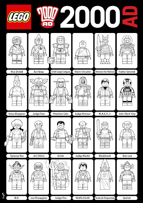
Here's the third installment of the Lego 2000ad characters I've been doing as commissions for Ian Leonard.

There may be a fourth (and final) batch in the offing.


Above in an easily clicked format are all 72 current characters.
Which ones remaining from 2000ad's illustrious history do you think are the glaringly obvious omissions? Who would you include in a fourth set of twenty-four? What characters would it be remiss to overlook in the final set?

From my own point of view, there are some I feel would work if they were going to be officially produced, but might not necessarily work as a variation of the standard and iconic Lego mini-figure.

All thoughts, comments or criticisms would be gratefully received!

Wednesday, 12 June 2013

2000AD Lego PART 2

A long while ago, I did a commission for Ian Leonard - Lego 2000AD characters, some may remember it, others may have stumbled onto it elsewhere on the web (it did do the rounds)!

Well, here's a second batch I finished for Ian a little while ago, and there is a third set currently sitting on my drawing board ready for inking!

Friday, 12 April 2013

d'Anger

A while ago, Terry Martin asked me if I could do an illustration for him. The brief was a simple one.

"I’m publishing a limited edition hardback of the American writer Matt Wallace’s The Failed Cities. Everyone who pre-orders will also receive a free 8-page 6”x9” booklet featuring black and white illustrations of the eight main characters in the book."

Here's a bit of the blurb:

"Told through the revolving voices of eight characters – a street preacher, a back alley negotiator, a hot-rodding master of edged weapons, brother and sister assassins, a pit fighting pulp writer, a reluctant detective, and a Machiavellian femme fatale – THE FAILED CITIES is the story of a divided dystopian metropolis, the humanistic struggles of its citizens, and how their lives intersect over several weeks of intrigue, greed, struggle, revenge, and love that threaten to unravel both halves of a flawed and beautiful whole."

I got to illustrate the femme fatale of the piece, the evocatively named d'Anger.

The house of Murky Depths is taking pre-orders for The Failed Cities now.

Saturday, 9 March 2013

Escape Pods

WOW! It's been a long-time since I posted anything here... all I can say is that the demands of being a full-time dad and a comic artist leaves very little time for frivolities like blogs and social media...

Anyway, before I digress any further!

Here's a page from part two of the upcoming "Banned Across the Universe" that I've been working on with John Freeman for ROK comics.

As per usual, I got carried away and spent some time in sketchup building escape pods...

As per usual, you can hardly see the effort I went to!

Tuesday, 11 December 2012

Feeling Festive

So, it's the silly season again... can't believe this year has gone so quickly.

For those of you who've missed my previous super-hero themed seasonal e-cards, here they are:

2011 Spidey's miscommunication

2010 Superman's snowman

2009 Batman's little friend

Anyone who hasn't received an e-card from me this year and normally does, or if you would like to receive one next year, please let me know!

Monday, 12 November 2012

The First Banned Cover Shoot

Last week, the cover for 'Banned Across The Universe' was leaked on facebook!

So, for those that missed it there, here it is, sans logos and stuff for now!

I did a couple of roughs, based on two well known images (the other needs to remain secret for now, in case we use it at a later date). This one though, I think, wears it's inspiration very obviously...

...for those that spotted straight off that this was a blatant compositional swipe (from the Star Wars poster below), take ten house points!

This has to be my favourite Episode IV poster, the original UK one sheet, with the other, 'opening crawl' style logo.

Wednesday, 12 September 2012

More Machine Than Man

I mentioned that I have had a touch of RSI in my thumb in my previous post.

I was away for a week in sunny north Norfolk last week. I had hoped that the problem would clear up with the rest. Nope!

Now, I've been prescribed some special gel to rub into my thumb and I've been given this splint to wear.

I feel decidedly Darth Vader-ish or Luke Skywalker-y! I've been told it should sort itself out in a couple of weeks. Interestingly, the most effective thing has been alternating the hand between bowls of warm and cold water. A minute in each and swap five or seven times, starting and finishing on warm!

The tendon in the thumb is inflamed and any strain will exacerbate the problem...

...I can type and drive a mouse, but pen-work has been nigh-on impossible. It's a worry, but hopefully, it should clear up in time for me to start the next episode of Banned Across the Universe!

Wednesday, 29 August 2012

Bowl Me Over

Just finished the inks for the first episode of Banned Across the Universe.

Some of these inks may be a little scrappy, but I've had a touch of RSI in my thumb over the last couple of weeks and that considered, I'm not that unhappy with the finished art.

This page, and I don't think it gives too much away, shows the main characters, in situ at the Hollywood Bowl. Now, really, to the unbiased eye, was this worth the effort involved?

The Bowl does appear another couple of times to similar effect in the strip, but still, I don't think you'd know what I went through!

Tuesday, 21 August 2012

The Final Frontier

I painted this over the weekend. Yup, paint, real life, real world, good old acrylic paint.

A much needed rest from the computer it was too!
Not exactly relaxation from the recent workload as I do need some space backgrounds for Banned Across the Universe (the strip I'm doing with John Freeman). Which, if you missed the official announcement, is being released as part of ROK comics expanded audio comics range.

No toothbrush, no photoshop (other than scanning and levels), all hand-painted. Actual dimensions 650mm x 500mm.

It didn't need to be in colour, as the strip itself will be coloured by my old pal Matt Soffe. BUT, as with most everything else to do with Banned Across the Universe, I got carried away, as will be seen in the coming months!

Finally, I'm also delighted that another old pal of mine, Jim Campbell will be rounding out the team on lettering duties!

Did I mention that I am excited about this project?

Saturday, 18 August 2012

Hollywood Bowl in Sketchup

For reasons I'd rather not dwell on right now, I needed to build a sketchup replica of the Hollywood Bowl this week... well, almost a replica - this was to be a future version...

In order to replicate some photographs, I needed to be fairly accurate. So first I did a search for the overall dimensions, which are, according to the article I found, 60' x 130' for the largest truss.

During the search, luckily I found this satellite view of the Hollywood Bowl, courtesy of the USGS (United States Geological Survey).

I imported the satellite image into sketchup, and from the very blurry image made some guesses as to the sizes of things, based mainly on that one dimension I had, and some other images from wikipedia to get a sense of the proportion of things.

Once I'd laid out the rough geometry of it, I was clear to start building the main elements. Initially I tried a couple of inner 'fin' versions but none were quite right.
Even though I was working at full size, I couldn't fit enough of them in, so my Hollywood Bowl (one of the future by the way!) has fewer fins than the real one.

For me, one of the most useful tools in sketchup for creating interesting and difficult shapes is the "follow me" tool. Define a flat shape, create a path and drag the flat shape along it to create your complex 3D object.

The seating in the amphitheatre would be impossible to create simply in sketchup without the "follow me" tool.

I added some simple 'tower' elements I'd already designed quickly. These were never intended to be particularly inventive or stylish, they were simply supposed to vary the look a little from the current Hollywood Bowl. Finally, I added the screens and some rough blocks to represent the surrounding buildings.

...only, I'd forgotten the darn lighting rig! Again, "follow me" was my friend in creating this element too.
Hooray! I have my own 3D posable Hollywood Bowl - I'll probably never need it again and in my opinion, you'd never know the trouble I went to from the artwork I've produced...

...having said that, the power of a having 3D environments that I can move, alter aspects of and change camera angles within makes my life a lot easier if I'm using something for multiple panels in a strip.
I think that I probably spend a little too much time in sketchup, creating objects and environments, but I'm never sorry when I can drop a complex object into my page layout and know I've got all the perspective correct... well, until I spoil it all by drawing the figures all wrong.